MOTION GRAPHICS & ANIMATION
LOGO REVEAL
Design Brief:
Create a 3 to 6 second long logo reveal animation that could be used for introductions to corporate videos, youtube channels, TV stations, websites etc. Organize and construct the logo in Adobe Illustrator so all elements that will animate are on independent layers and use techniques such as keyframing, masking, easy-ease motion, motion blur, transition effects. Logo reveal should be quick, fluid and eye catching.
Create a logo reveals of one logo design that could
be used for introductions to corporate videos,
personal brand, youtube channels, TV stations,
website etc
Organize and construct your logo in Adobe Illustrator
so all elements that will animate are on independent
layers.
Logo reveal should be 3 to 6 second. Storyboard
your animations. Have a plan.
Logo reveal should be quick, fluid and eye catching.
Use techniques learned throughout the course such
as (position, scaling, rotation, opacity) keyframing,
masking, easy-ease motion, motion blur, transition
effects.
STOP MOTION ANIMATION
Design Brief:
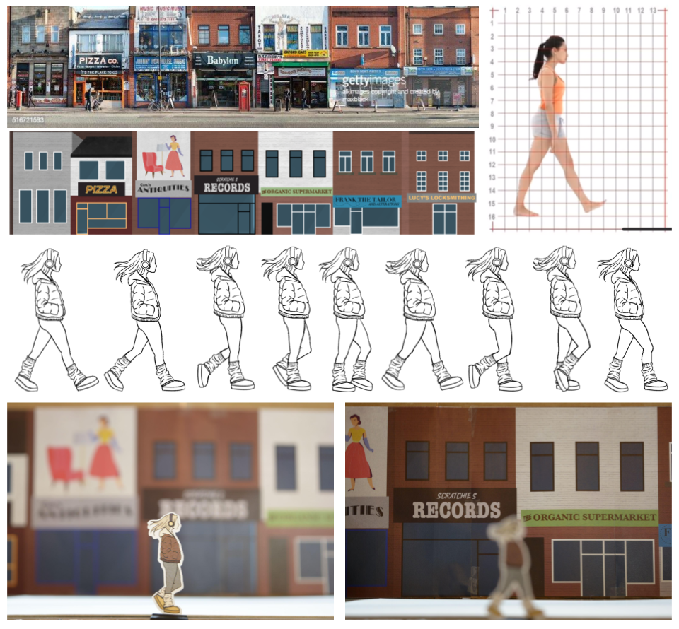
Stop Motion animation is a cinematic process/technique used to make static objects appear as if they are moving. Objects are physically manipulated in small increments between individually photographed frames to create the illusion of motion. The objective was to produce a five or more second long stop motion at 10 frames per second.
I found a youtube channel that creates movement references and studied the female walking video frame by frame to reference for my drawing. After illustrating each frame of the character walking, the frames were printed and cut out using a Cricut. A city strip with character was referenced for the street illustration, which was then printed and glued onto a long piece of cardboard. The character frames were clipped into the foreground with the city strip a few inches behind to create perspective. Between each photograph, the character’s walking frame was switched and the city strip was moved slightly. To really give a sense of perspective, I used a short depth of field while shooting and changed the focus to highlight all artwork presented.

KINETIC TYPOGRAPHY / LYRIC VIDEO
Design Brief:
Produce a short (20 to 60 seconds) kinetic typography video using a song, quote or voiceover. Using typographic design, animate multiple words/compositions of text in synchronization to audio. Exercise techniques such as basic position, rotation and scaling, motion blur and easy ease transition keyframes. Make use of pre-composing layers and parenting layers to a null objects.
I decided I wanted to incorporate my animation capabilities somehow in this project, so once I chose the song (Come Together by The Beatles), I tried to think of something rhythmic to add to the intro. A simple rain drop animation was illustrated frame-by-frame to ensure synchronicity to the music. Then a water-like transition was illustrated to give contrast from the black and white intro to the colourful text. A purple and orange colour scheme was used on big bold lettering, reminiscent of the Beatles’ psychedelic-rock style. Another illustrated animation of an eyeball was used later in the video to give more dimension to the otherwise text-only visuals. The text was manipulated to give the lyrics movement and express the story being told, before the final fluid transition back to black.
DIGITAL DIORAMA

Design Brief:
The objective was to create a scene with depth and a moving perspective. Designer’s choice to use assets, illustrate the piece or use a combination of the two. Use sounds and visuals to create a convincing atmosphere.
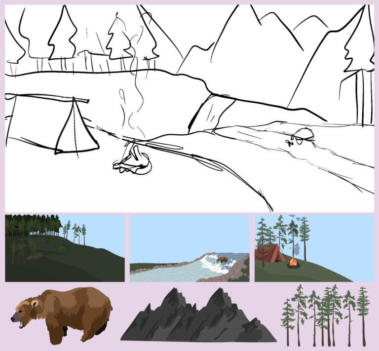
I decided to base my scene around the idea of incorporating a bear in a river. A sketch was drawn first to configure the layout and determine how the scene would be layered. Once the position and orientation of each layer was determined, I illustrated each layer of the scene; starting with the bear in the river, followed by the campsite in the foreground, then the tree line and mountains in the background. The camera function in Adobe After Effects was used to give the scene dimension and highlight each layer presented.