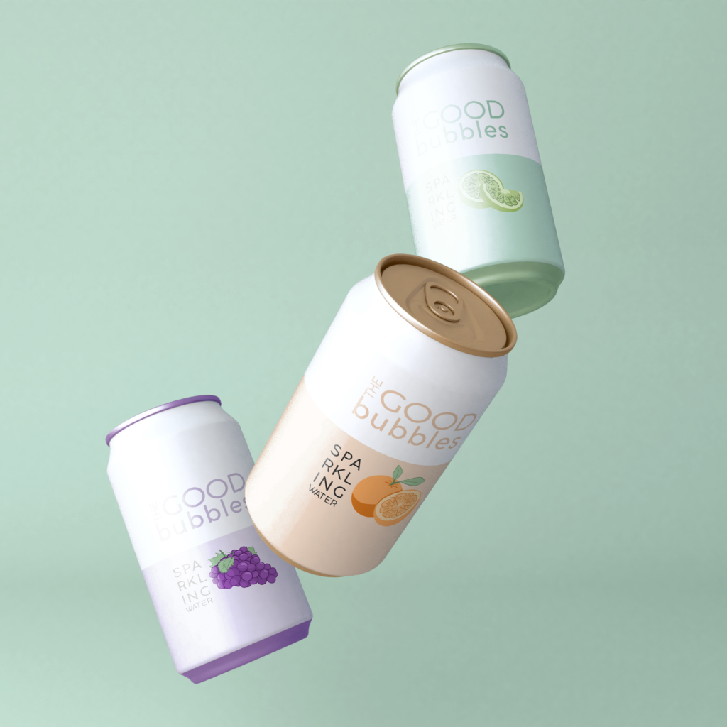
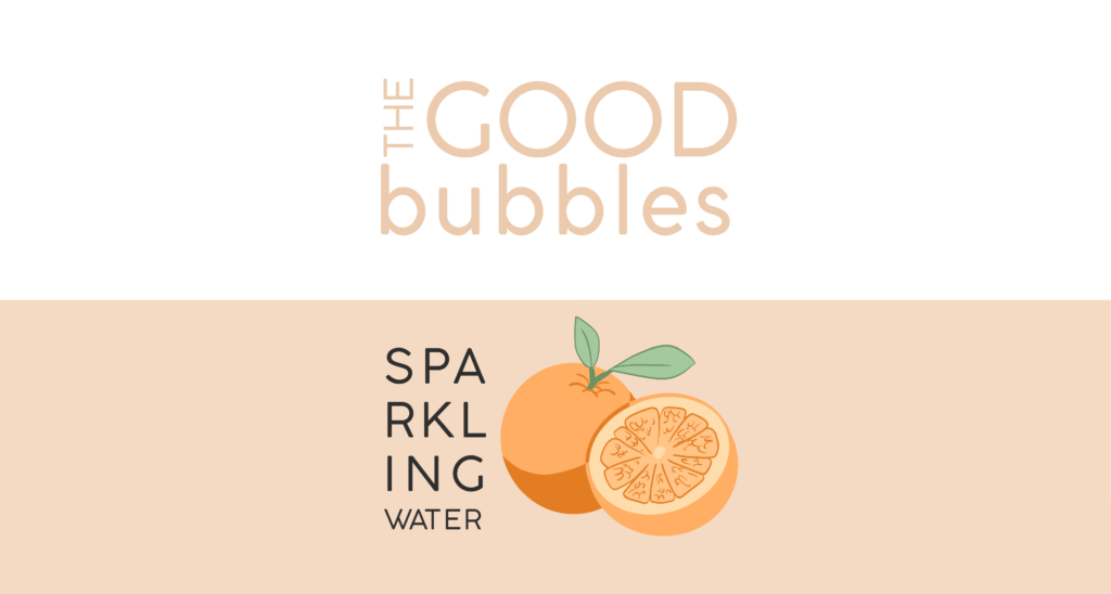
I chose to create a can of sparkling water. I wanted to keep the design minimalist with the colours primarily conveying the message (fruity, fun, which flavour, etc.). I used simplicity and modernity to draw the attention of younger people who usually reach for pop, offering a healthier alternative; thus the name THE GOOD bubbles.
THE GOOD BUBBLES
Design Brief:
Create a 3D label design for a product. The objective is to be able to create a 3D revolve object and design a complete illustration ready for applying onto a 3D product using live trace, symbols and many of the other illustrator techniques learned to date.
When sketching concepts for the logo, the letter G was usually emphasized because G is a strong letter, besides being the first letter of the business name. The final icon was created by illustrating a letter G out of rocks and placing it in front of a stone silhouette. This was done to create an iconic image that would be recognizable as Graystone. Muted cool tones were chosen, such as baby blue and a purple toned grey to convey a feeling of calm and trust. A muted orange was also used to provide warmth to both the look and feel of the design/brand.
GRAYSTONE COUNSELLING
Design Brief:
Graystone Counselling is a counselling practice targeted toward adults seeking mental health help. The “Gray” in Graystone symbolizes how there is a lot of gray area in emotions and understanding and perspective isn’t always black or white. The “Stone” is used in the name for it’s solid structure, representing strength and courage. A brand colour scheme, an icon logo, profile picture and header image were needed for brand consistency.
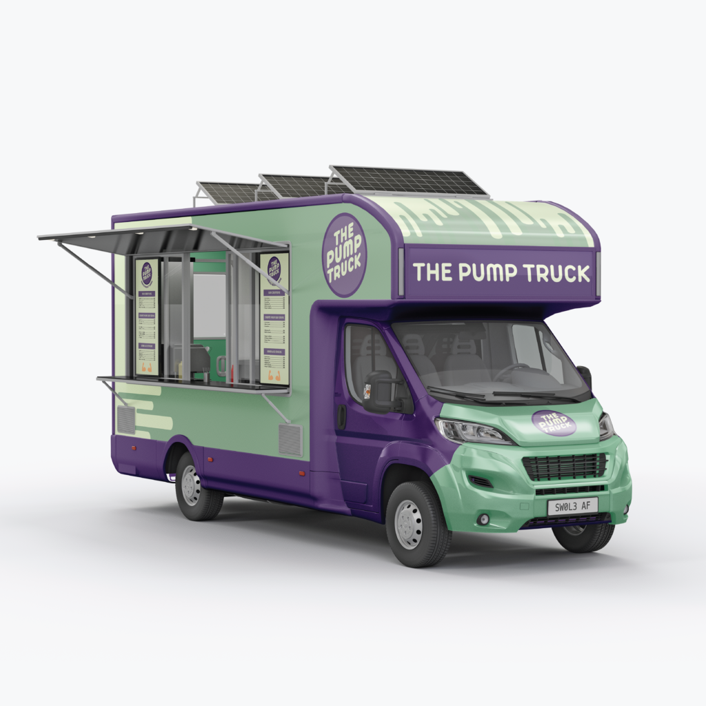
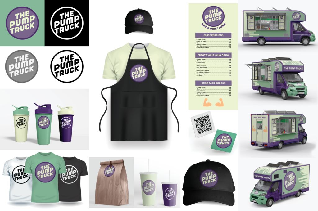
THE PUMP TRUCK
Design Brief:
Design a food truck brand by determining the target market and develop a brand story. Design a logo, collateral and brand guideline. The objective is to understand the story of a brand, who it is intended for and how to create designs based on guidelines.
While deciding on a theme for a food truck, the idea of uniqueness and individuality was a priority. I considered what kind of restaurant I would like to see, but haven’t. I decided on designing a food truck geared towards athletes, and called it The Pump Truck (a play on words between a muscle pump and dump truck). Two shades of green were selected for brand colours, symbolizing health and freshness. The other two brand colours selected are purple, to contrast the green and represent personal power and confidence. The brand values simplicity, therefore minimal shapes were used in the design of the truck. Lines were added along the side of the truck to give the appearance of smoothie/shake-like fluid running off the truck as it drives. The products’ designs are only the logo and brand colours, to continue the simplicity theme and keep the focus on the feel of the colours.