Layout a letter size 4 page folded information booklet. The subject for the booklet is designers choice, must be informational and be on either the health or infrastructure industry. This booklet should be simple, attractive and easy to both read and understand the information/material. The main objective is to create a design that will make a less desirable topic more engaging and fun.
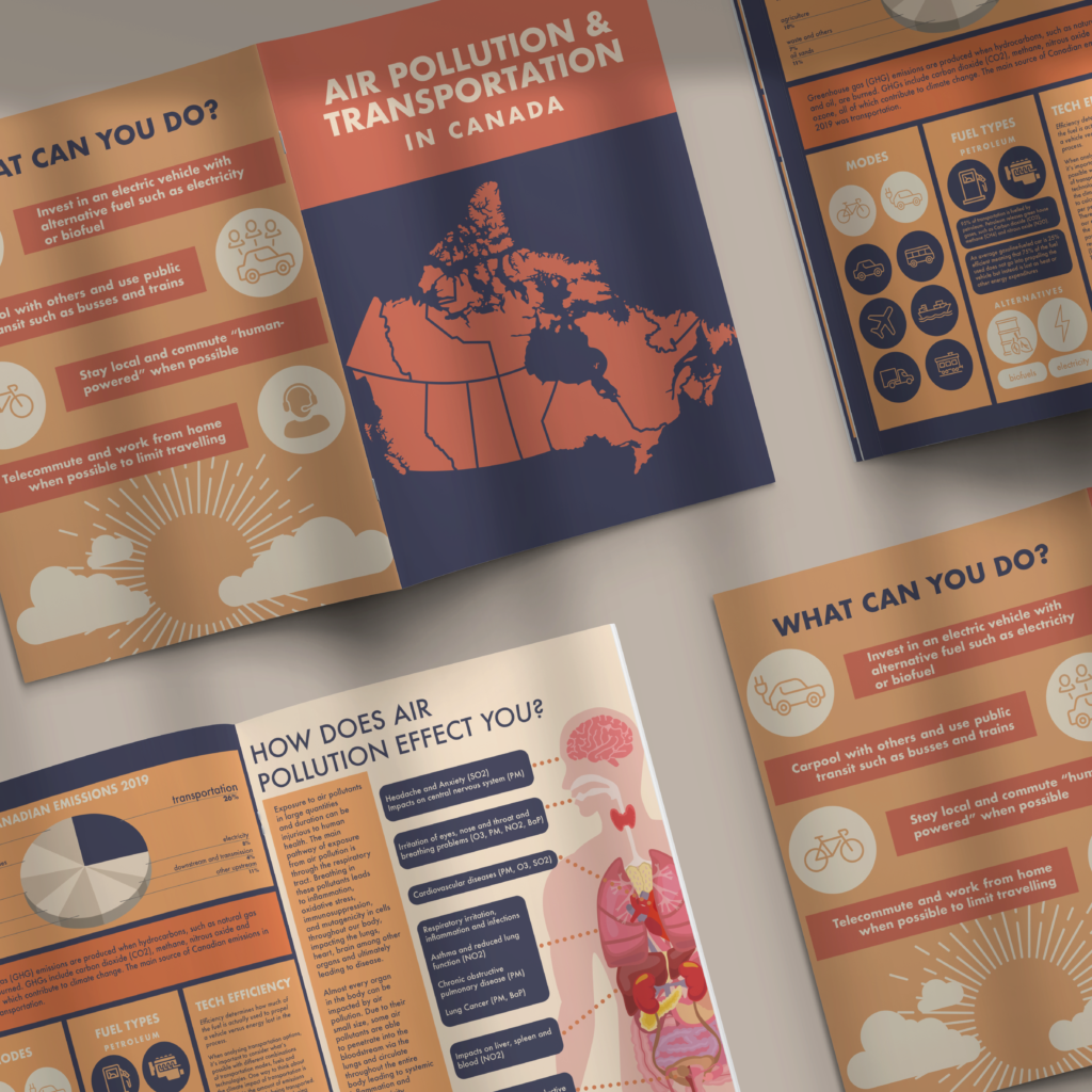
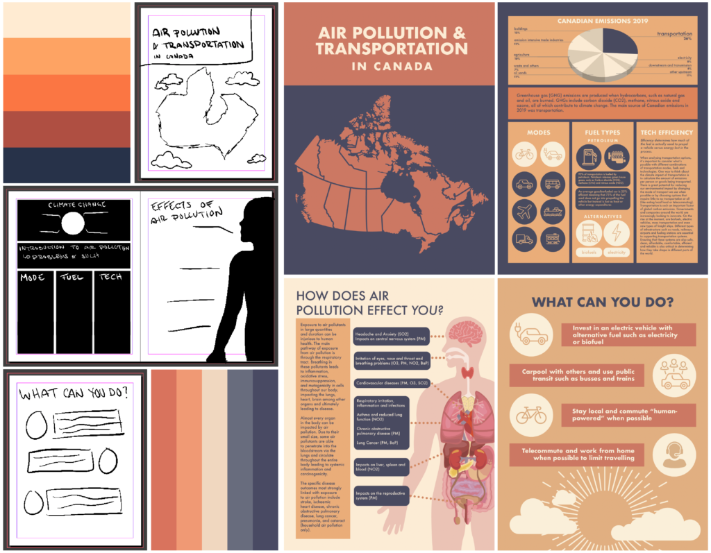
Global climate change is a major issue, however not many people know what kind of difference they can personally make. This informational booklet was made with the intention of educating readers on how to reduce their footprint; by reducing emissions caused by transportation. The flat icon design keeps the design simple and illustrates messages without needing much text to understand their meaning. Complimentary colours, blue and orange were used to create a minimal yet colourful and attractive colour palette. Supporting text describes how climate change affects the individual and relies on the graphics to thoroughly communicate the ideas presented. The overall aesthetic of the booklet makes a serious topic a pretty one.
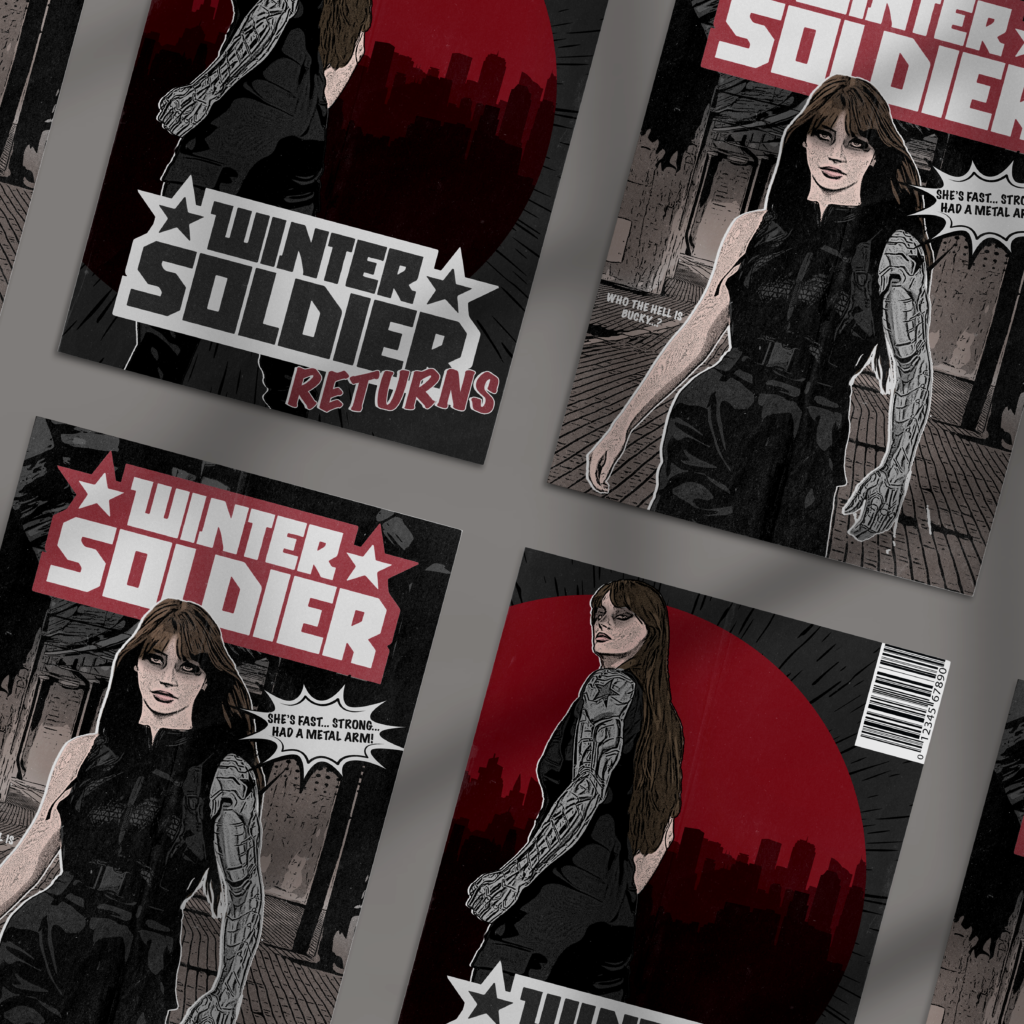
COMIC BOOK COVER
Design Brief:
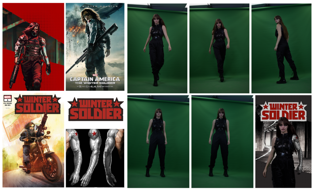
Source references of comic book covers and photograph a character (model in costume) on a green screen. Extract your subject, source a background that suits your reference to place behind your subject and make any edits necessary in Photoshop and Illustrator to create the comic book look. Add to mockup. The objective is to explore editing methods and techniques while trying to maintain a specific style/aesthetic.
This character, the Winter Soldier, has a darker story and struggles a lot with his trauma and brainwashing from the villains of the story. I chose to cosplay the Winter Soldier because I believed it would be an interesting story to try and convey. While taking the photos in the studio, I tried to look especially brooding and determined. Thus, the strut and look over the shoulder. The Winter Soldier is known for his metal arm and all black attire. His primary used colours are black to identify the edginess of the character, red for strength and danger and silver to signify his metal arm. These colours were used primarily in the covers to keep the image about the character’s “brand.” The red was used particularly as an eye-catcher and to contrast the rest of the low saturation imaging. Quotes of real dialogue from one of the Winter Soldier’s movies that represent his story were placed on the first cover, to create intrigue for the story.
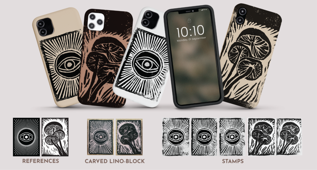
LINO-BLOCK PRINTING
Design Brief:
Carve a reference image into a lino-block to be made into a stamp and apply stamp to a mockup. Objective is to practice the art of print making and application of design.
After images were referenced, they were recreated as vector images, printed and transferred onto lino blocks. The designs were carved into the lino using carving tools, then ink was rolled over the surface. The ink was stamped onto paper until the image was satisfactory and applied to a phone case mockup using Photoshop.
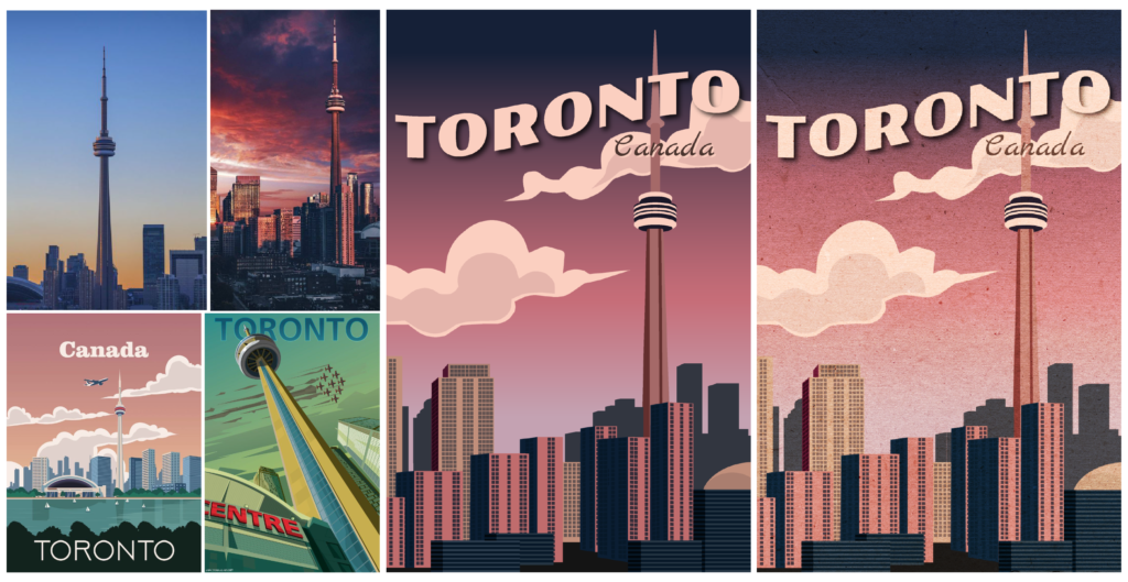
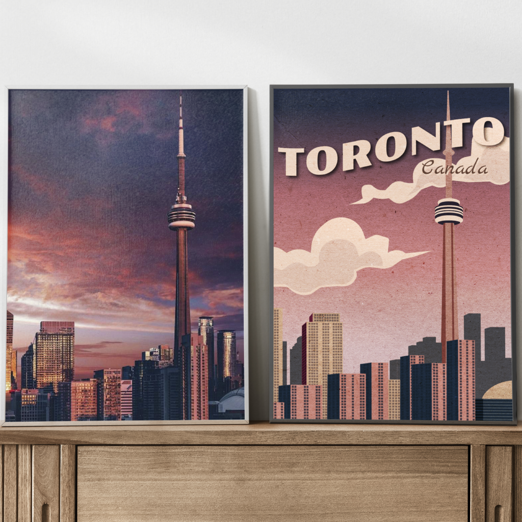
VINTAGE POSTER
Design Brief:
Create a landmark poster using geometric-style illustration and vintage trends. Objective is to produce a believable vintage print feel by utilizing both Adobe Illustrator and Photoshop.
After studying vintage poster styles, choosing a location and referencing images, one of the reference images was recreated as a vector illustration using Adobe Illustrator. A flag effect was applied to the text and a paper texture was overlayed in Photoshop to lean into the vintage feel. It was then applied to a mockup to look like a salvaged vintage poster.